
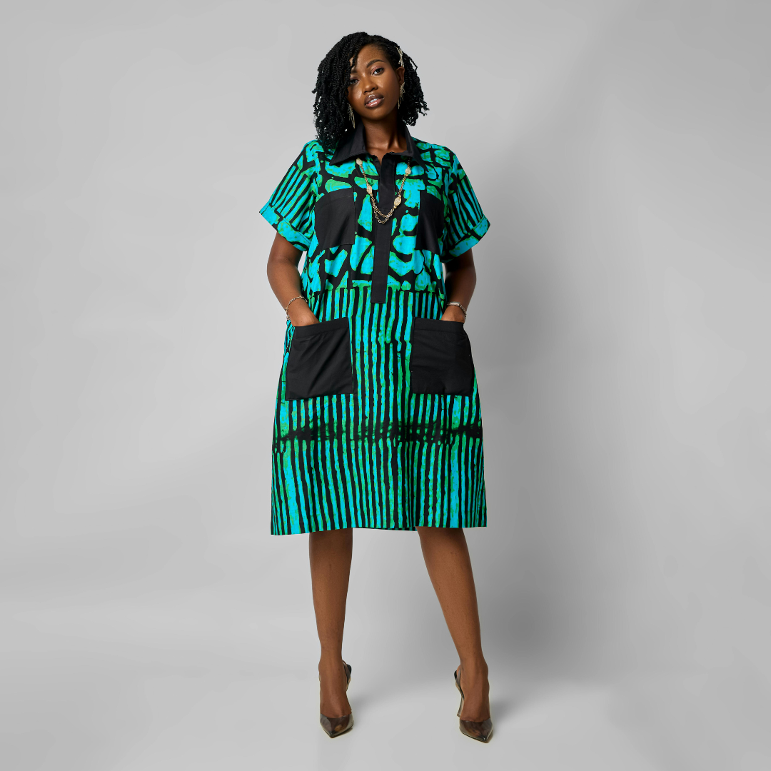
Bold prints can add personality and energy to an outfit, but they often risk overwhelming the look if not styled carefully. The key is balance—pairing bold prints with simpler pieces and muted colors helps maintain a polished appearance without clashing or feeling too busy.
They should avoid mixing multiple striking patterns or flashy accessories that compete for attention. Instead, letting one bold print be the focus allows for a cohesive and confident style.
Understanding how scale, color, and placement impact the overall look can help anyone wear bold prints with ease and subtlety. This approach prevents the outfit from appearing overdone while showcasing the print’s unique appeal.
Choosing the Right Bold Prints
Bold prints can create striking looks when chosen carefully. The key is understanding different print styles, how they interact with body shapes, and the most flattering sizes and placements for patterns in a wardrobe.
Understanding Different Types of Bold Prints
Bold prints vary from large florals and geometric shapes to animal prints and abstract designs. Each type carries a distinct vibe and visual weight. For example, large florals tend to draw attention to the areas they cover, while geometric patterns offer a modern, structured feel.
Animal prints like leopard or zebra add an edgy texture. Abstract prints provide artistic flair but can be overwhelming if too busy. Choosing prints that align with the intended style and occasion helps maintain balance and prevents the wardrobe from feeling chaotic.
Selecting Prints That Suit Your Body Shape
Prints can emphasize or downplay certain body areas, so matching patterns to body shape is essential. For those with a pear-shaped figure, smaller prints or prints concentrated on the upper body create balance. In contrast, larger prints on an athletic frame can add curves and dimension.
Vertical prints elongate and slim, benefiting shorter or fuller figures. Horizontal or circular prints amplify width, so they work best on slimmer frames. Knowing how print placement interacts with body shape maximizes style impact without overdoing it.
Balancing Pattern Size and Placement
Print size impacts the wardrobe’s visual harmony. Large prints can dominate and may overwhelm shorter or petite frames. Smaller prints are versatile and easier to combine with other pieces.
Placement matters: prints focused on one part—like a patterned blouse or skirt—can anchor an outfit. Spreading bold prints evenly risks clutter. For a polished look, pairing one bold piece with neutral basics keeps the wardrobe cohesive and avoids visual overload.
Building an Outfit Around Bold Prints
Creating a well-balanced look with bold prints requires control over colors, complementary pieces, and layering techniques. Focusing on a limited color palette, grounding prints with neutrals, and carefully choosing outerwear or accessories helps maintain style without overwhelming the outfit.
Applying the Three-Color Rule
The three-color rule limits an outfit to a maximum of three main colors. When styling bold prints, this rule keeps the look cohesive and prevents visual clutter. For example, if a shirt features red, navy, and white, the pants and shoes should primarily reflect one or two of these colors.
This method also helps when picking accessories. A handbag or shoes in a neutral color or a hue already present in the print keeps the focus on the bold pattern. The key is repeating colors thoughtfully rather than adding unrelated shades.
Pairing Prints With Neutrals
Neutrals act as a calm backdrop to bold prints. Choose classic wardrobe staples like black trousers, white skirts, or beige jackets to let the print stand out. This contrast reduces distraction and strengthens the overall look.
Shoes in neutral tones such as tan, black, or white are ideal when wearing loud prints. Avoid patterns or bright colors on footwear that could compete with the printed piece. Textured neutrals, like suede or leather, can add subtle interest without overpowering the outfit.
Layering Without Clashing
Layering with bold prints demands careful selection of materials and colors. Outerwear or cardigans in solid, neutral shades balance patterned shirts or dresses. Avoid additional printed layers to stop the outfit from appearing busy.
If layering with another patterned piece, ensure the secondary print is smaller, more subdued, or in the same color family. This helps achieve depth without visual overload. Lightweight fabrics work best, as they maintain the print’s clarity and prevent bulkiness.
Accessorizing Bold Prints With Confidence
Balancing bold prints with the right accessories is key to a polished look. Bag, shoes, and jewelry choices need careful consideration to avoid clashing or overpowering the outfit.
Selecting the Right Bag for Printed Outfits
When pairing a bag with bold prints, simplicity often works best. A solid-color bag that matches one of the colors in the print creates cohesion without competing for attention. Neutral tones like black, beige, or white are safe bets for versatility.
Size and shape matter. Structured bags add polish, while slouchy styles can soften intense patterns. Avoid bags with loud patterns or too many embellishments, as they can conflict with already busy prints.
Matte or leather textures help keep the look refined. For example, a black leather crossbody complements floral or geometric prints nicely.
Choosing Shoes to Complement Bold Patterns
Footwear should balance, not battle, the print. Solid colors that echo a hue from the outfit or neutral shades like nude, black, or white work well. Bright shoes may distract unless they are intentionally coordinated with one of the print’s colors.
Styles like clean-cut loafers, simple sandals, or classic pumps keep the focus on the print. Avoid overly detailed shoes like those with heavy patterns or excessive studs.
In casual looks, white sneakers pair easily with many bold prints, offering subtle support without competition.
Jewelry and Other Subtle Accents
Jewelry should remain minimal to avoid overwhelming bold prints. Thin gold or silver chains, small hoops, or stud earrings maintain sophistication.
Avoid large statement pieces or overly colorful accessories. Instead, choose delicate designs that add shine without drawing focus.
Other accents, such as belts or scarves, should follow the same rule—limited pattern or solid colors echoing the print’s palette. This maintains harmony and allows the bold pattern to stand out confidently.
Integrating Bold Prints Into Your Long-Term Wardrobe
Incorporating bold prints into a lasting wardrobe involves balancing statement pieces with timeless items. It requires thoughtful mixing, mindful rotation, and seasonal updates to keep looks fresh yet wearable over time.
Mixing Prints With Wardrobe Staples
Pairing bold prints with classic staples helps ground the outfit. Solid colors like black, white, navy, or beige reduce visual clutter and allow the print to stand out without overwhelming.
Denim, tailored trousers, and simple blouses are safe anchors when wearing loud patterns. For example, a floral print blouse looks polished with neutral slacks or jeans. Accessories should remain minimal to avoid competing with the print.
Mixing prints requires careful scale consideration. Smaller prints usually pair well with larger ones, but spacing and color palettes should align. Sticking to one or two printed pieces per look maintains balance and prevents excessive clash.
Rotating Bold and Subtle Pieces
A practical wardrobe cycles bold print items with understated garments. This rotation avoids burnout from heavily patterned clothes and ensures versatility across different occasions.
Alternating between printed skirts, jackets, or scarves and solid basics gives the wearer flexibility. Bold prints should be treated as accent pieces rather than staples to enhance rather than dominate daily wear.
Keeping track of how often prints are worn helps maintain freshness. Those who document outfits can identify favorite combinations and avoid repetition. Careful upkeep, like proper storage, extends the life of bold print fabrics.
Updating Your Style Seasonally
Seasonal updates in bold prints involve adjusting color schemes and fabric weights. Warmer months favor bright and light patterns, while cooler seasons call for deeper hues and heavier materials.
Investing in versatile prints that transition between seasons minimizes wardrobe overhaul. For example, a leopard print can appear in both summer dresses and fall scarves through differing textures.
Incorporating seasonal accessories with prints, such as hats or bags, can refresh looks without large purchases. Paying attention to current print trends while maintaining personal style ensures ongoing relevance.